By Emma Bowman
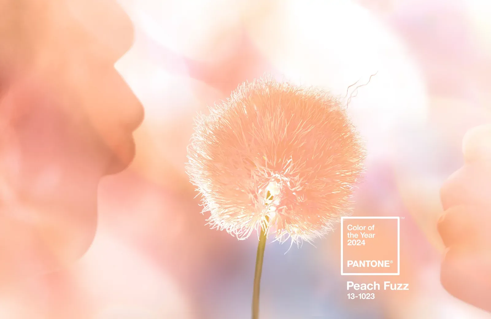
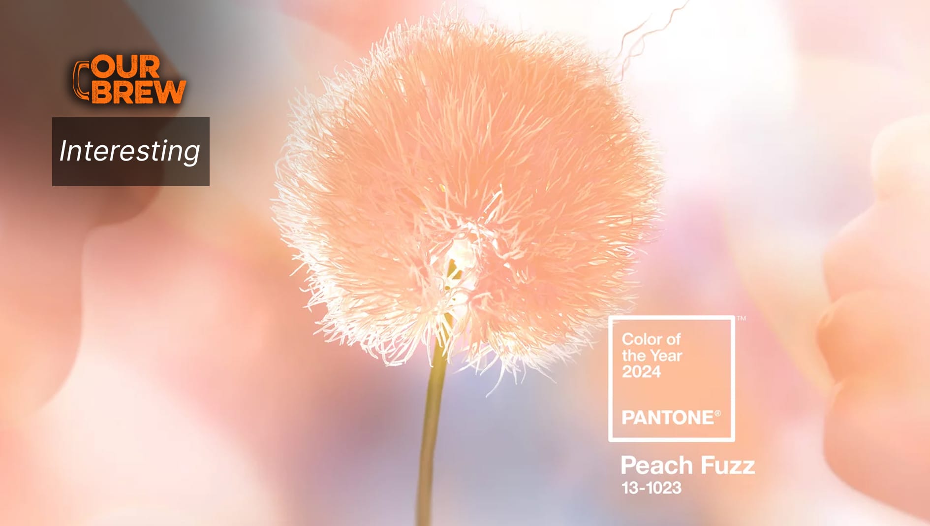
The world's authority on color has spoken: 2024 is the year of "Peach Fuzz."
The Pantone Color Institute named its color of the year on Thursday, declaring our need for compassion and human connection in the year ahead.
According to influential color consultancy, only one shade can deliver on that front: Pantone describes the orange-pink hue as gentle, warm and cozy, subtly sensual and heartfelt.
Peach Fuzz, a "velvety peach tone" is meant to represent "our desire to nurture ourselves and others" and "whose all-embracing spirit enriches mind, body, and soul."
"In seeking a hue that echoes our innate yearning for closeness and connection, we chose a color radiant with warmth and modern elegance. A shade that resonates with compassion, offers a tactile embrace, and effortlessly bridges the youthful with the timeless," said Leatrice Eiseman, Pantone's executive director, in a news release.
To pick the color that will set the tone for the year ahead, Pantone considers emerging trends across a range of industries. Experts comb the entertainment industry and films in production, new artists, fashion, all areas of design, aspirational travel destinations, new lifestyles, socio-economic conditions and other influences.
"Influences may also stem from new technologies, materials, textures, and effects that impact color, relevant social media platforms, and even upcoming sporting events that capture worldwide attention," the company said.
Pantone's colors of the year end up shaping product development and consumer decisions in fashion, industrial and interior design, product packaging and other industry areas.

Pantone previously picked Viva Magenta for 2023 and Very Peri for 2022.
The new, orange-pink hue brings comfort, calm and beauty to a digital world, the company said; it's modern, while also referencing the past.
"At a time of turmoil in many aspects of our lives, our need for nurturing, empathy and compassion grows ever stronger as does our imaginings of a more peaceful future. We are reminded that a vital part of living a full life is having the good health, stamina, and strength to enjoy it," said company vice president Laurie Pressman. We needed a color "whose gentle lightness and airy presence lifts us into the future," Pressman added.
Many on social media agreed with the pick, describing it as beautiful and refreshing. Others panned the color as boring, out-of-touch and unflattering.
Some commentary found the peach to be reminiscent of an overplayed vintage hue. The color "reminds me of every 90s home color decor of choice," one Instagram comment read.
"The world is neither peachy nor fuzzy anymore. Pity," another person wrote.
One tongue-in-cheek critique characterized the peach as "a very democratic shade considering it doesn't look good on anyone."
Reactions to the announcement revealed that a lot of people were expecting, even rooting for, a year of green.
"At least it coordinates with a deep green or a steely green, but it feels like the people needed the hope, regrowth, and steadfastness that come with a green year," one user wrote.
First published in NPR. You can read the article here.
If you liked what you just read and want more of Our Brew, subscribe to get notified. Just enter your email below.


Related Posts
Pope Leo Xiv is the First Member of the Order of St. Augustine to Be Elected Pope – but Who Are the Augustinians?
Jun 04, 2025
People Say They Prefer Stories Written by Humans Over AI-generated Works, Yet New Study Suggests That’s Not Quite True
Apr 02, 2025
What are AI Hallucinations? Why AIs Sometimes Make Things Up
Mar 25, 2025